Project
Meditative Story Website
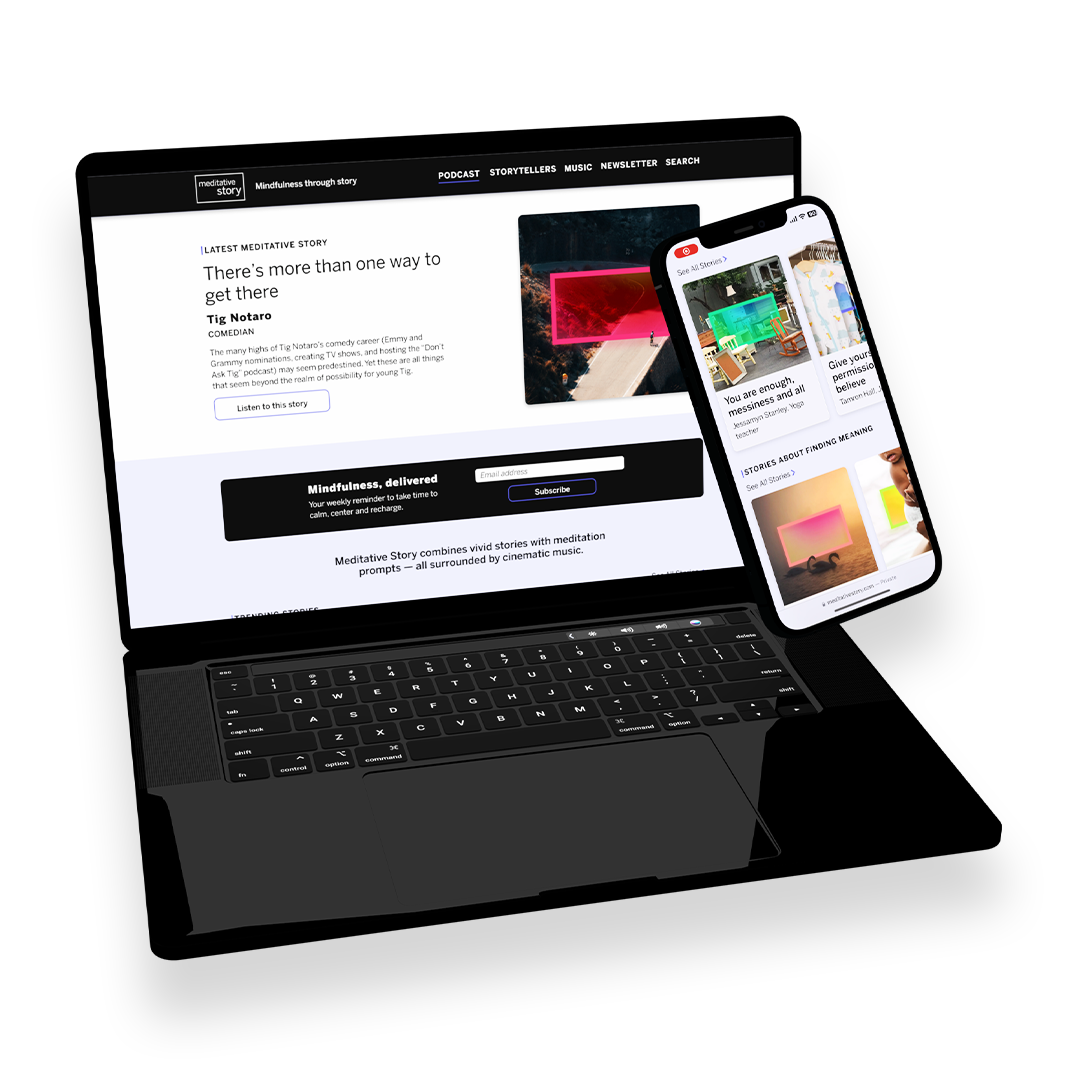
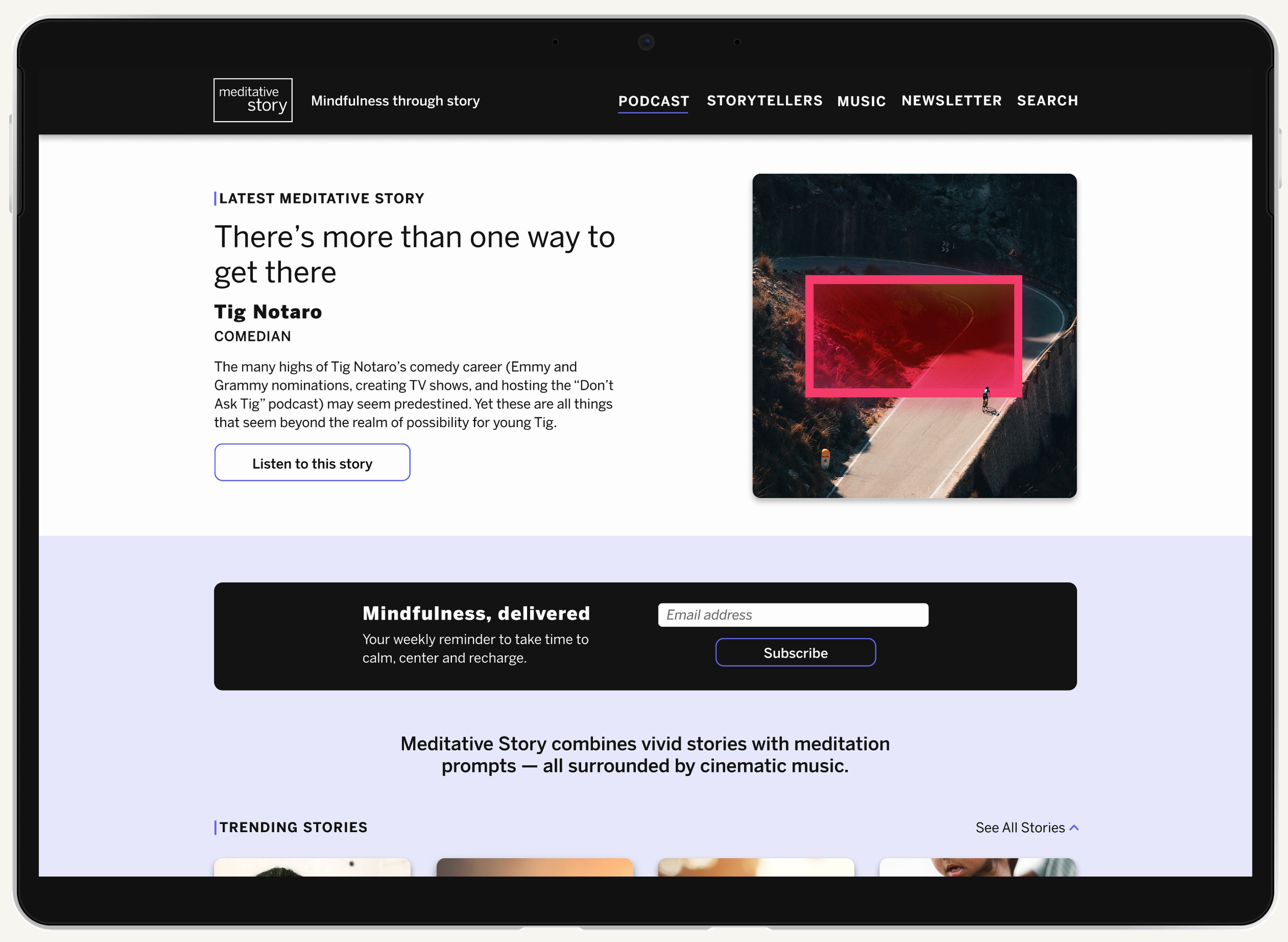
An updated website for Meditative Story media property
View the live site here.
Client
WaitWhat Inc.
Meditative Story podcast combines the emotional pull of first-person storytelling with the immediate, science-backed benefits of mindfulness practice — all surrounded by breathtaking and cinematic music.
This property has been recognized by industry leading awards — every year since inception. Among them are The Webby Awards, The Signal Awards, and The Ambies.
Roles
Branding, Web design, UX research, wireframing, UI design, prototyping, user testing, documentation
Duration — May 2023 – Sept 2023
Overview & Initial Research
This project was a complete overhaul of the Meditative Story website as part of my in-house work for WaitWhat Inc. I was lead web/graphic designer on this project with brand oversight by Tim Cronin, graphics contributions by Sammie Oputa and Luisa Velez, site development by Scott Fennell, content writing and curation by Colin Howarth, and product strategy and management by Anna Pizzino, Lori Hoffman, & Nicki Williams.
The problem: The original Meditative Story website had some major accessibility and back end functionality issues. It did not reflect the growing Meditative Story brand and did not meet company expectations.
The goal: The main goal was to design a site that would meet accessibility standards (KPI: receive 100% scores on Lighthouse testing). A largely stakeholder-driven project, some other considerations included the desire to increase newsletter subscriptions through the site and the extending of the site’s brand story beyond the podcast to include other property extensions. The site also had to be flexible and future-proofed for a 3.0 destination site update that would include multiple media types such as articles and video.
I conducted both primary and secondary research in the form of user interviews and a competitive audit.
My user interview pool was limited to internal team members and stakeholders. Along with the competitive audit, I collected secondary user research from a previous site I designed for WaitWhat that largely followed the same goals and content patterns (reference MastersofScale.com).
Sitemaps & Wireframes
Though stakeholder interviews, secondary research, and by referencing Meditative Story’s legacy site, I developed a site map that would become the North Star for both the design and workflow of this project.
From there, I began to sketch quickly wireframes options before turning to figma to develop the UI kit and Hi-fi porotypes.
Hi-fi prototyping, Branding, & UI Design
After collecting feedback on the sitemap and wireframe sketches, I developed a UI kit for the site and iterated on responsive hi-fi prototypes for both desktop and mobile.
View the working prototypes here.
Iteration & Development
After several rounds of iteration and testing, I packaged the site for development. From there, I worked with our team to collect content, rewrite placeholder copy and translate the designs into a live site.
View the live website here.
Conclusion
Impact: After shipping the site, our Lighthouse testing scores were 100% across the board. We’ve increased our site email subscribers and the site now tells the story of the brand beyond the podcast. The flexible modular design of the site also sets us up for the introduction of new content types and a future destination site iteration.
What I learned: A major learning from this project was the importance of accurate content representation. When we’re working with artistic, conceptual photography as representations for content, it’s important to pair those images with text that accurately describes the content. The user needs to be able to decide in a split second which piece of content they want to engage with and the title and attribution usually grabs attention for podcast content over the show art.
Next Steps: After the MVP website was developed, we entered a second phase where we restyled and implements an awards banner system, voting module, and awards page based on a site I designed previously (reference MastersofScale.com). The next phase will be adjusting designs after we’ve collected a well-sized pool of user feedback and metrics from Microsoft Clarity. At that time, we’ll also return to our website goals and adjust for the growing needs of the company.


